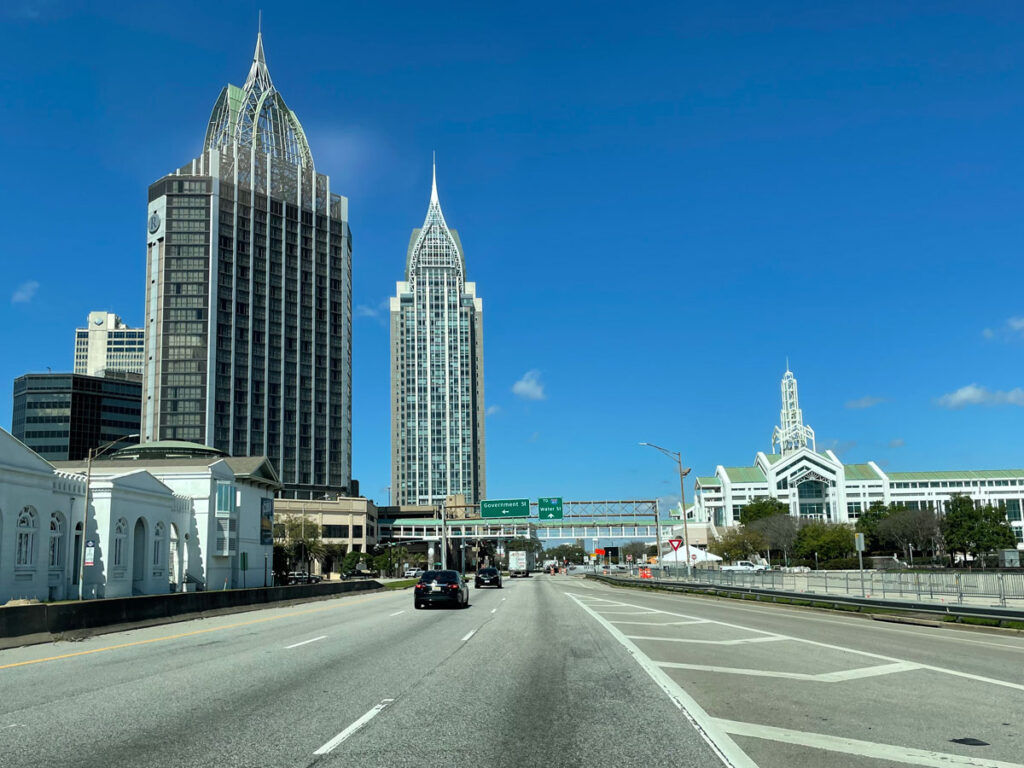
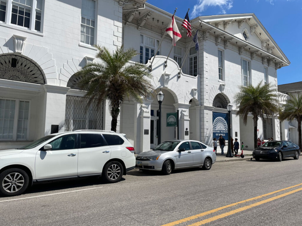
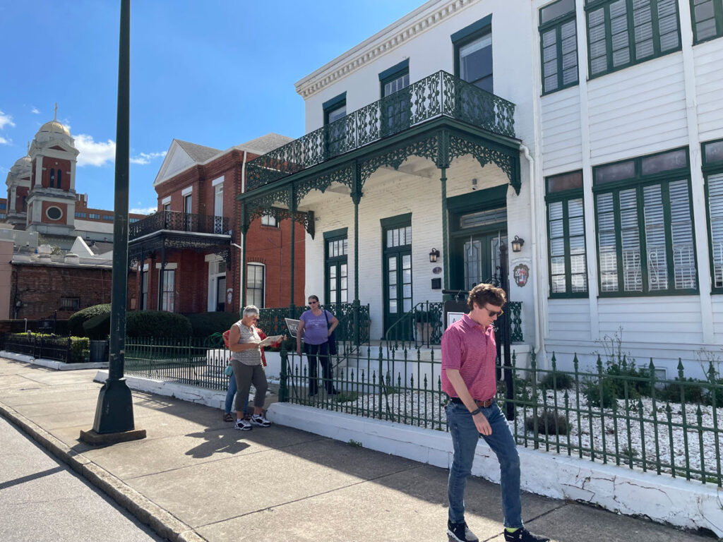
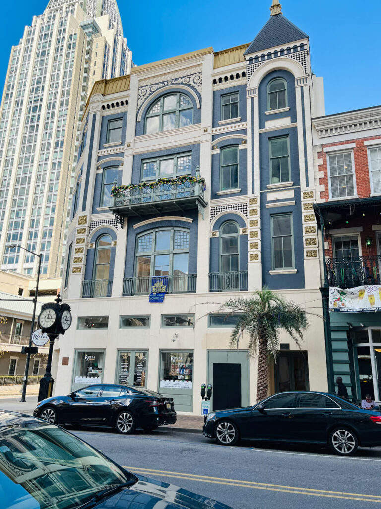
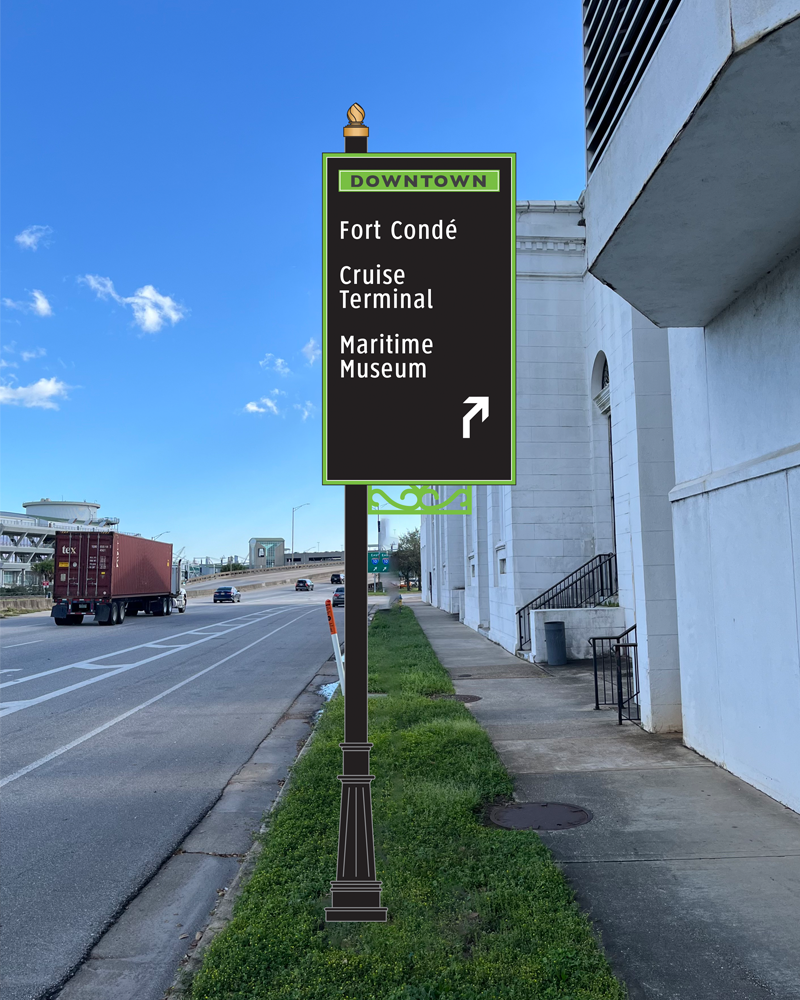
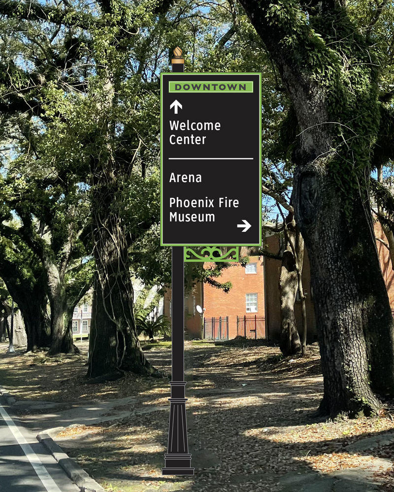
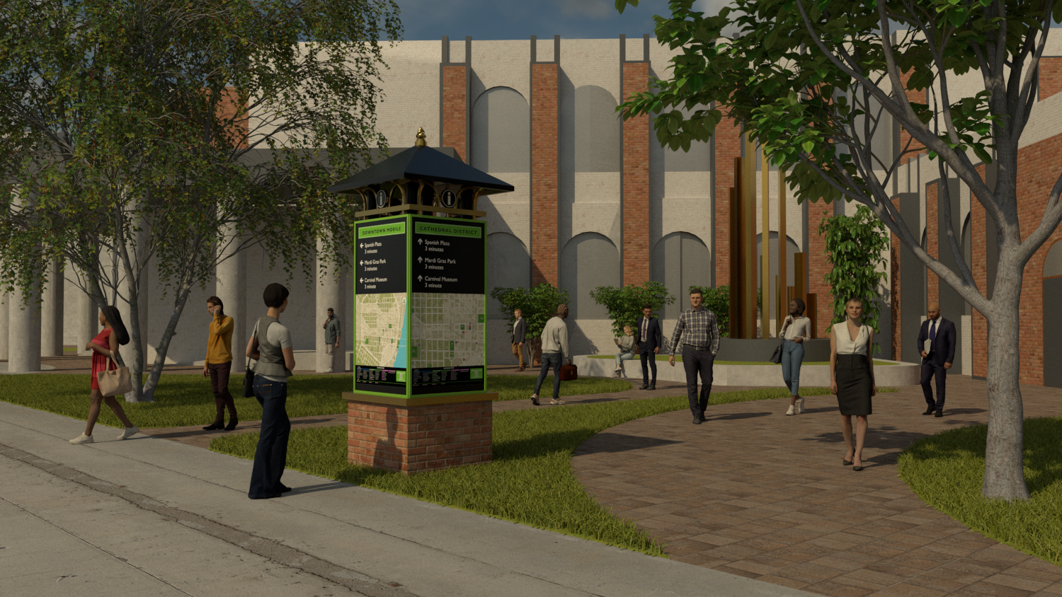
For many visitors to Downtown Mobile, the experience begins long before they reach their destination. Whether arriving for a convention, a waterfront event, or an afternoon exploring the city’s historic streets, visitors must first navigate unfamiliar roadways, locate parking, and transition from vehicle to pedestrian. This project developed a wayfinding strategy that connects each stage of that journey, linking arrival, orientation, and pedestrian navigation into a seamless experience that encourages confident exploration of downtown.
From Arrival to Exploration
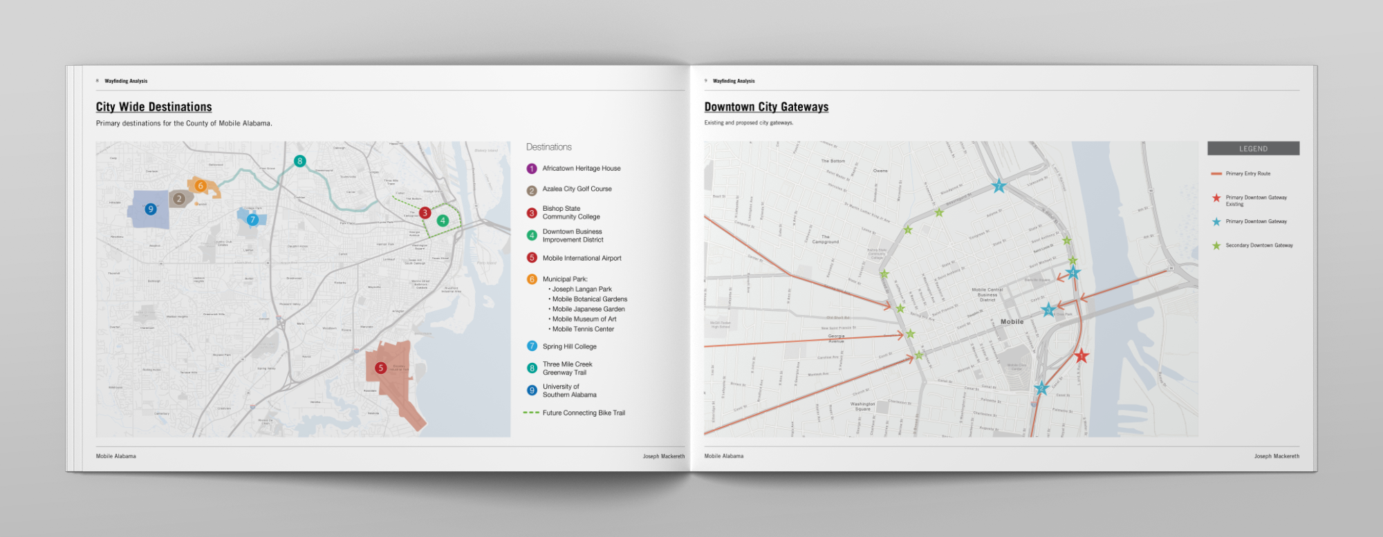
Downtown Mobile attracts visitors through a network of gateways, event venues, and waterfront destinations. While parking was abundant, the relationship between arrival, parking, and pedestrian movement lacked clarity. The project examined how visitors transition from driving to walking, recognizing that successful pedestrian navigation begins long before someone reaches the sidewalk. By organizing this sequence into a cohesive wayfinding strategy, the system encourages visitors to confidently explore downtown on foot.
Parking as the Beginning of the Journey
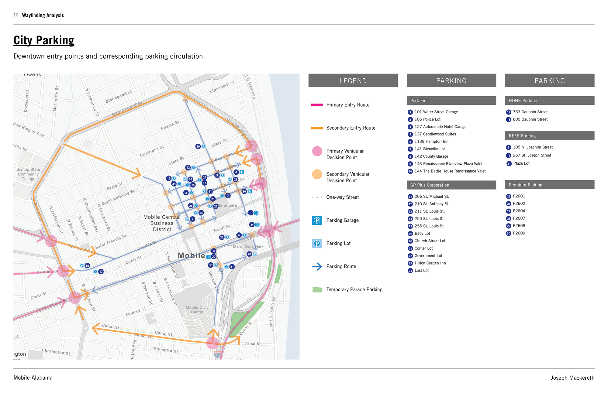
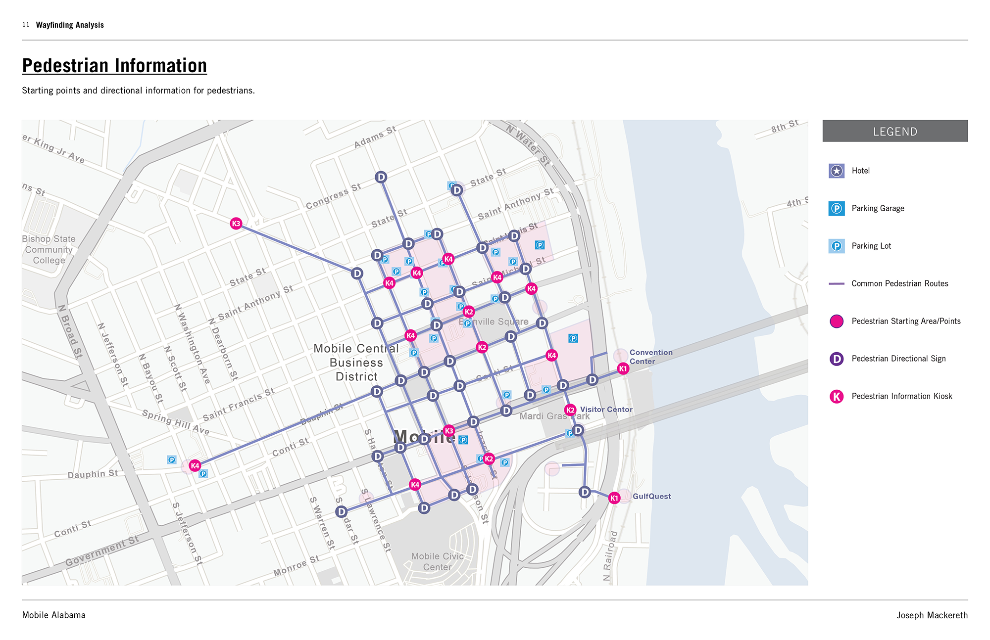
The analysis identified primary and secondary vehicular routes that guide visitors into the downtown core and evaluated how parking circulation influenced their arrival experience. Rather than treating parking as an isolated destination, the strategy connected parking facilities to the broader wayfinding system. Directional information was concentrated at major vehicular decision points, allowing drivers to locate parking efficiently while establishing predictable pedestrian starting locations throughout downtown.
Information at the Point of Arrival
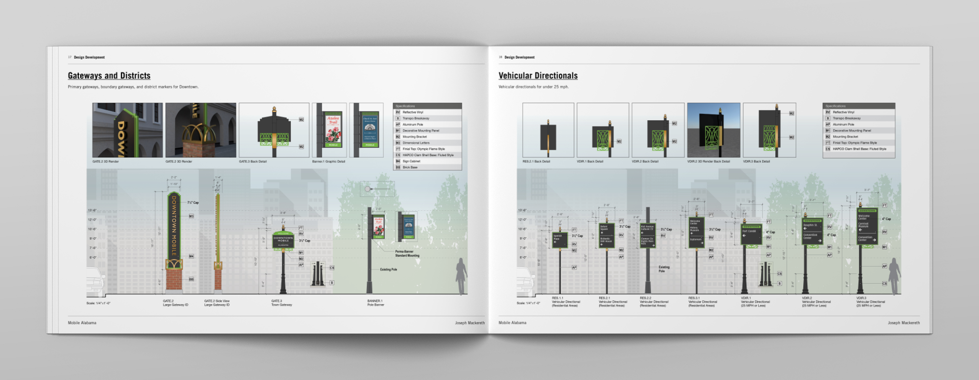
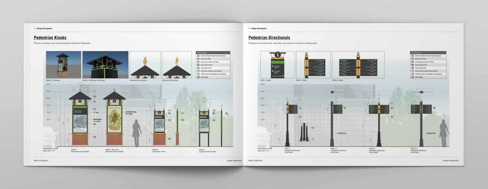
Once visitors leave their vehicles, their informational needs shift from driving to walking. Orientation kiosks and pedestrian information signs were strategically located near parking garages, surface lots, hotels, the convention center, and other common arrival points. These locations provide maps, destination information, and walking routes at the moment visitors are most likely to ask, “Where am I, and where should I go next?” Delivering information at these transition points reduces uncertainty and establishes confidence before visitors begin exploring downtown.
Guiding Pedestrian Movement
From each arrival point, the pedestrian wayfinding network leads visitors along the city’s primary walking routes toward civic destinations, entertainment districts, hotels, and the waterfront. Directional signs reinforce decision points while orientation kiosks provide broader context within the downtown street network. Together, the parking strategy and pedestrian information system create a continuous sequence of navigation—from entering downtown, to parking, to confidently exploring the city on foot.
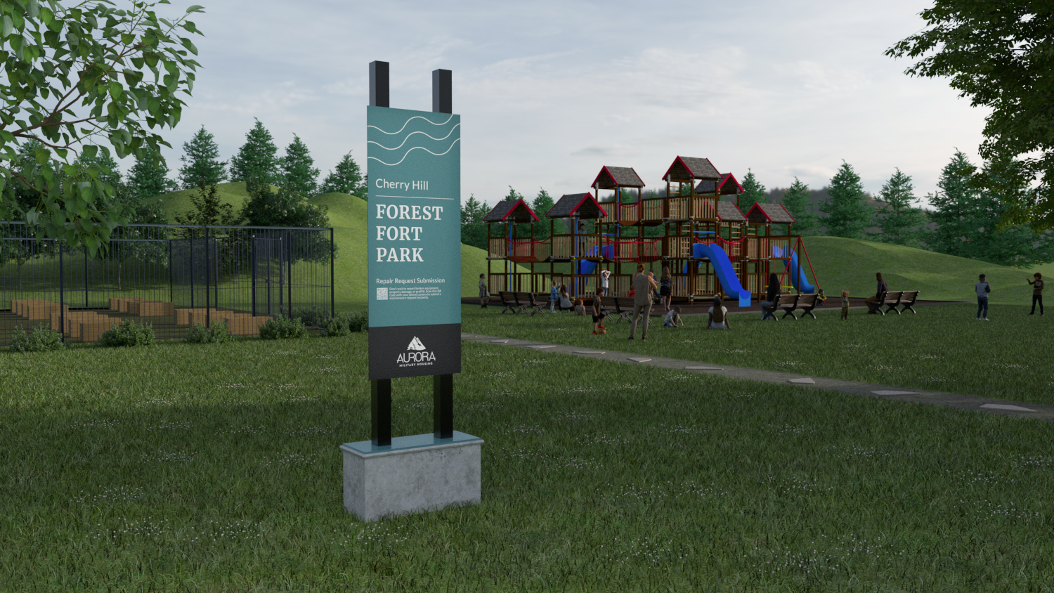
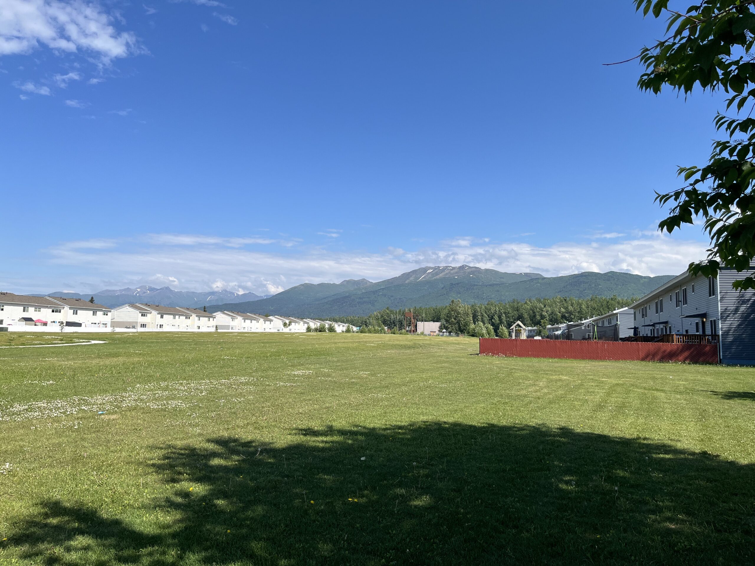
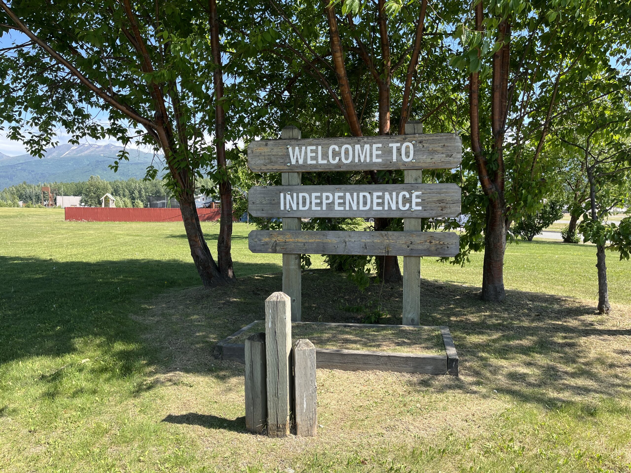
Aurora Military Housing encompasses multiple residential neighborhoods distributed throughout Joint Base Elmendorf-Richardson in Anchorage, Alaska. While residents access housing through a network of base gates and roadways, the scale of the community and the separation between neighborhoods can make navigation challenging for both new residents and visitors. The project focused on creating a clear wayfinding framework that strengthened navigation while reinforcing the identity of Aurora Military Housing as a unified community.
Establishing a Primary Route
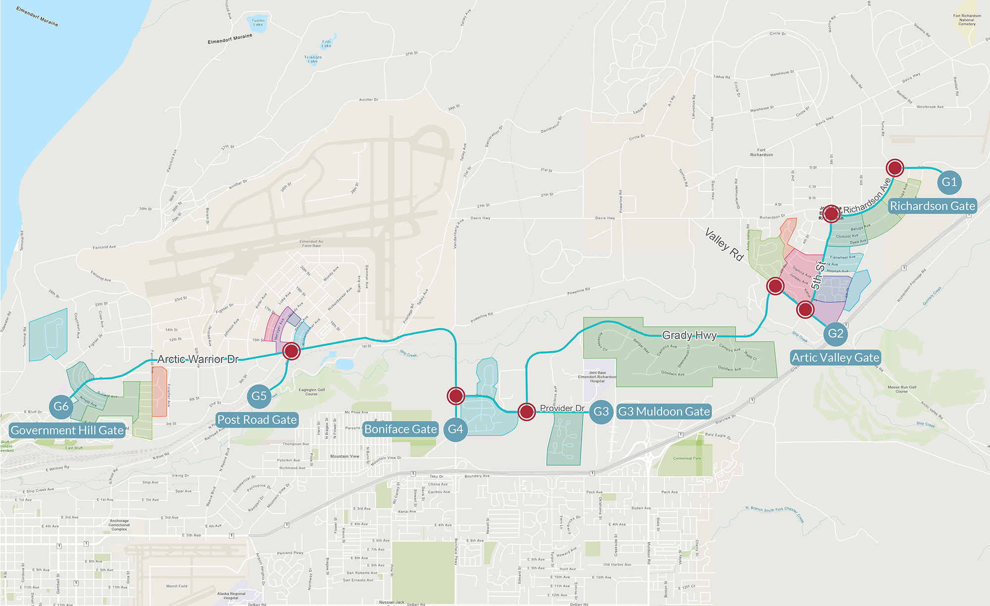
The wayfinding strategy began by identifying the primary travel route connecting the major housing areas, community facilities, and entry gates. Rather than treating each neighborhood as an isolated destination, the system organized navigation around a series of key decision points where drivers require information. By concentrating directional information at these locations, the strategy established a clear path through the community and improved connectivity between neighborhoods, facilities, and the broader base environment.
Building an Information Hierarchy
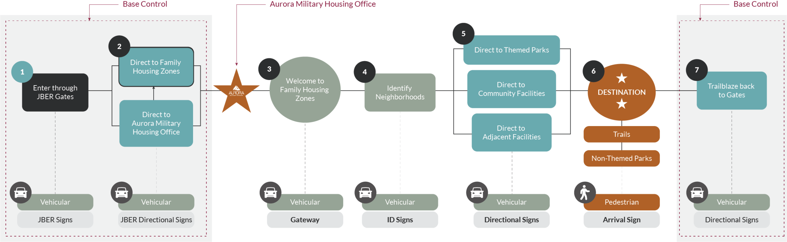
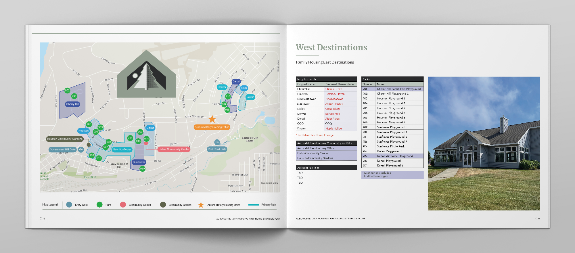
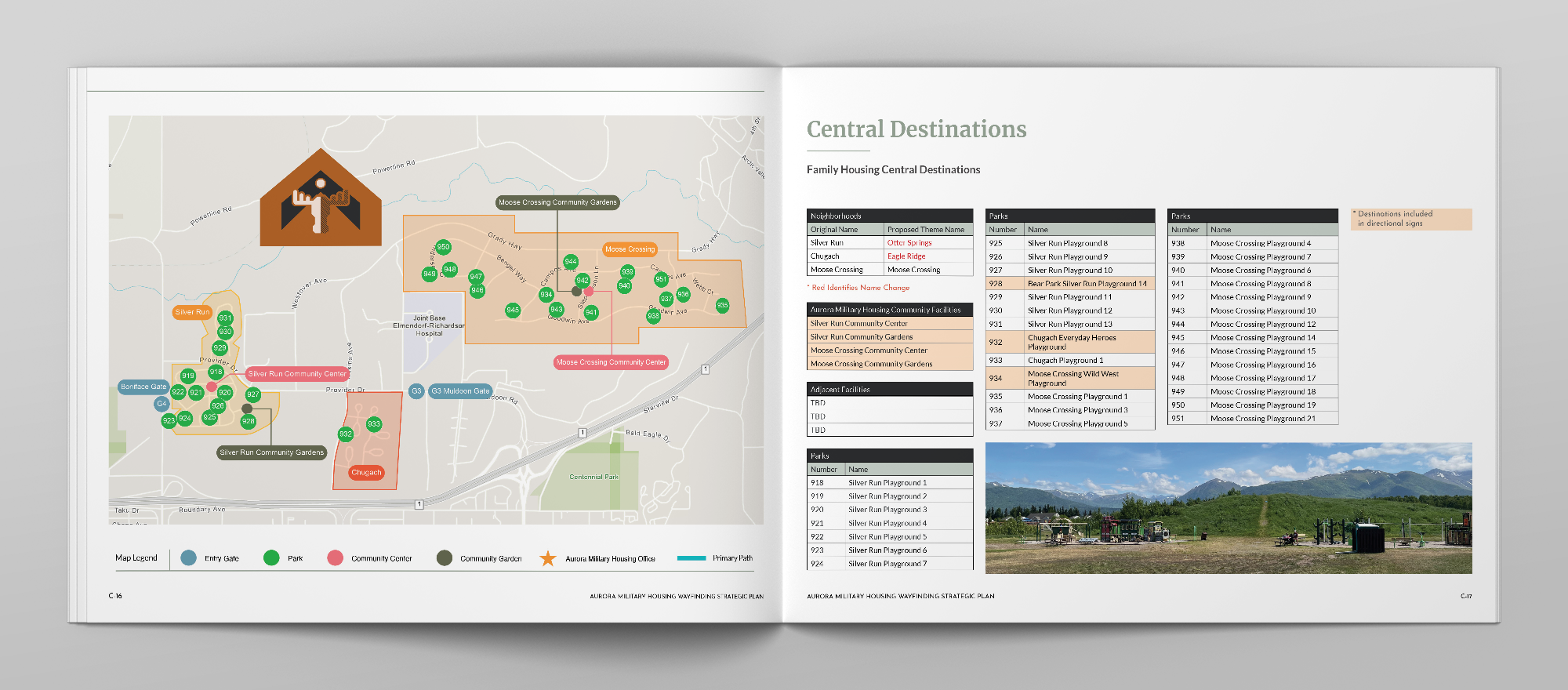
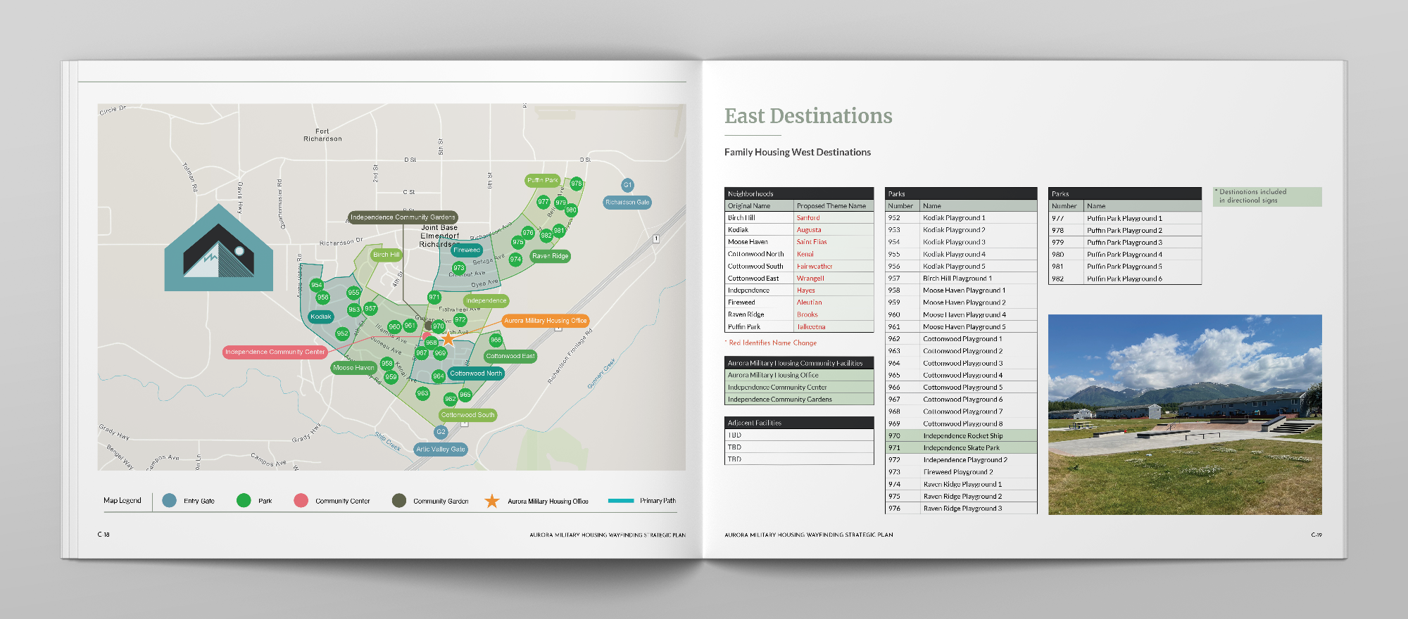
A layered information hierarchy was developed to guide residents from broad geographic references to increasingly specific destinations. Visitors are first directed toward major housing zones, then to individual neighborhoods, and finally to community destinations such as community centers, playgrounds, and recreation facilities. This approach follows the principle of progressive disclosure, reducing information overload by providing only the information needed at each stage of a journey.
Zones, Neighborhoods, and Playgrounds
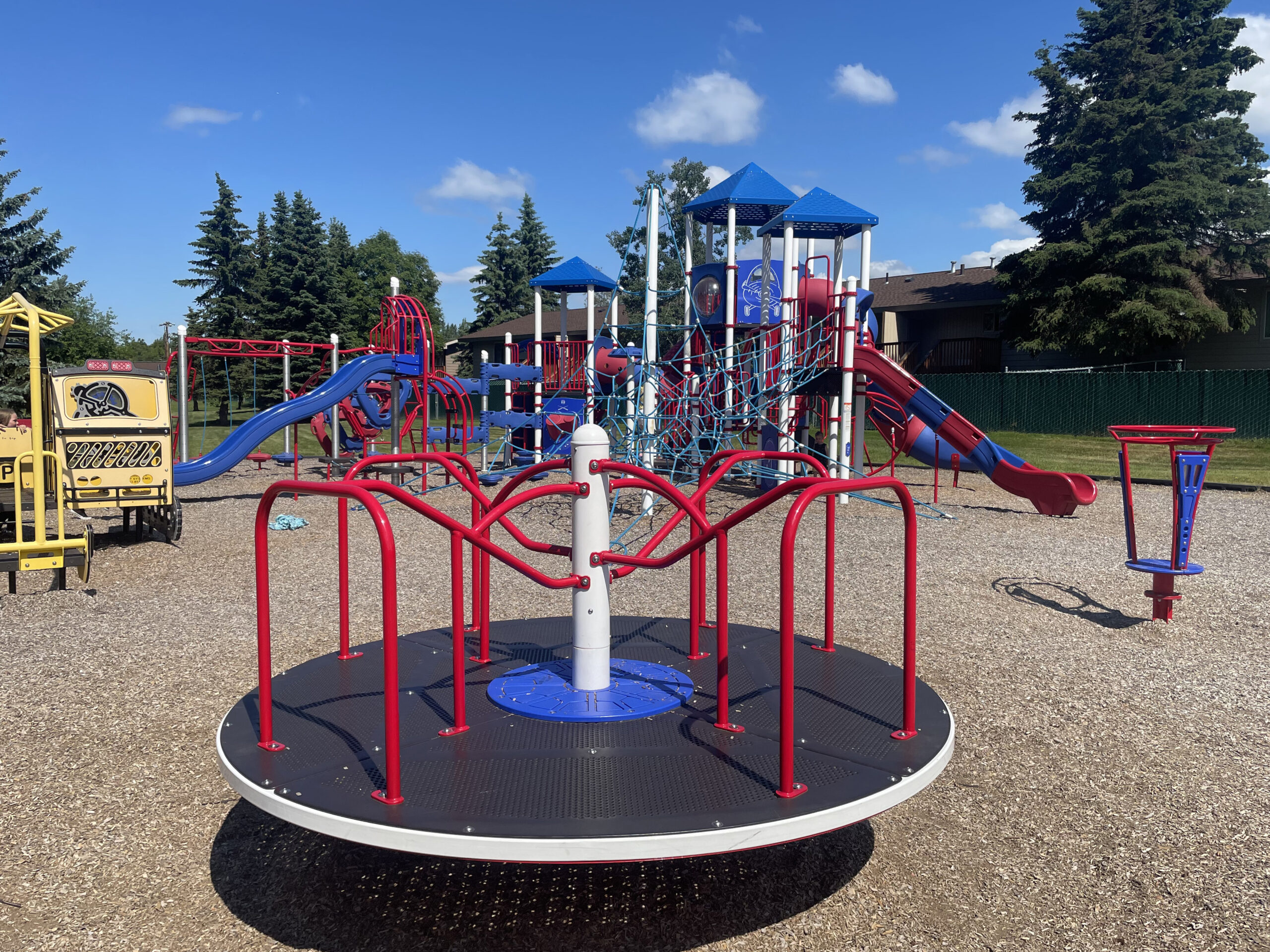
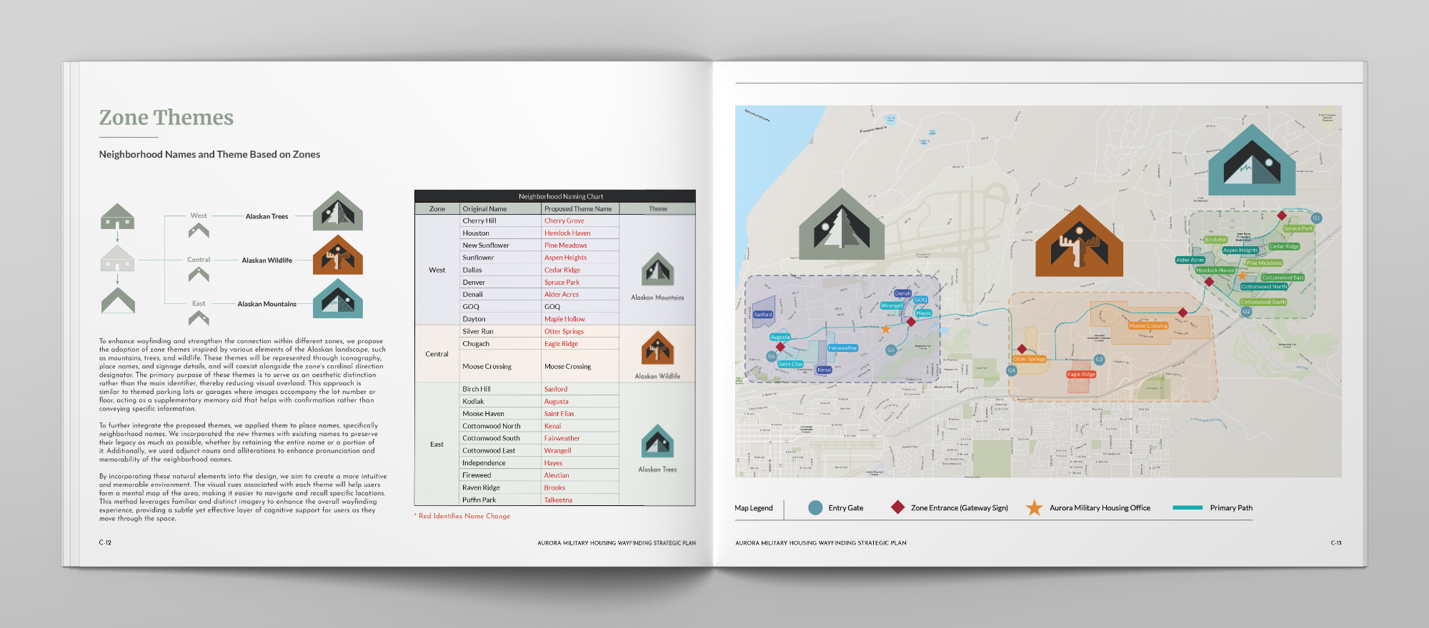
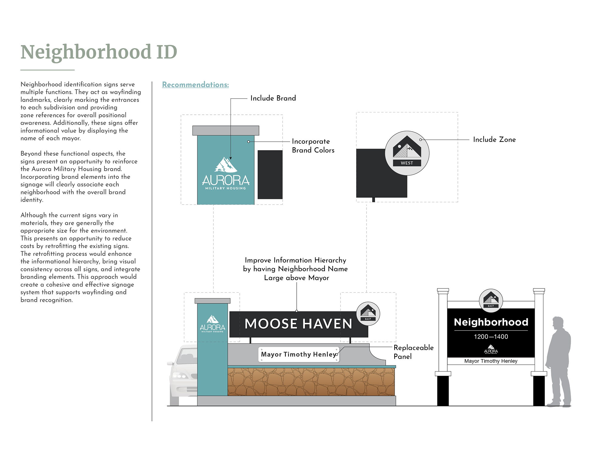
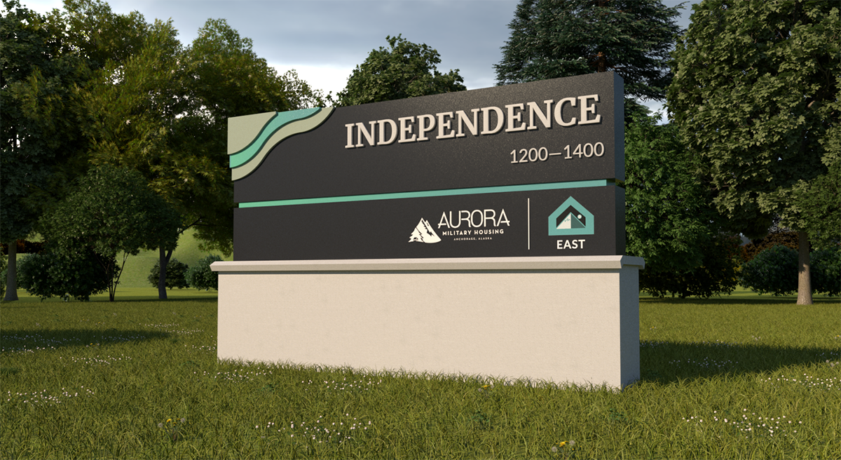
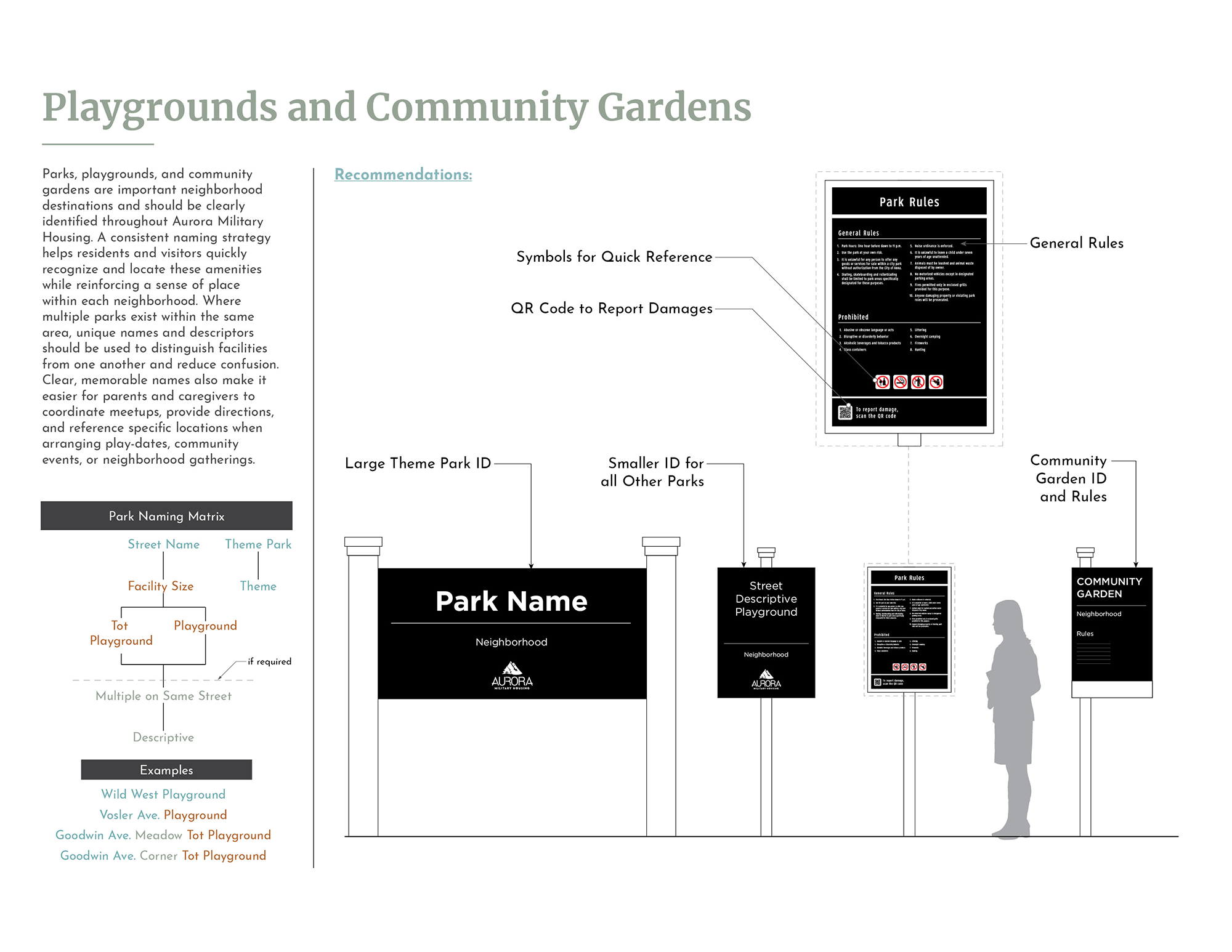
To simplify navigation, neighborhoods were grouped into East, Central, and West zones based on cardinal directions and their relationship to the primary route. These zones provide residents with an immediate understanding of their location within the larger community while supporting the development of a mental map of the housing areas. Within each zone, neighborhood identification signs were restructured to prioritize neighborhood names while maintaining references to the larger zone. Key destinations, including themed playgrounds and community facilities, were integrated into the hierarchy as secondary destinations that help residents navigate between neighborhoods and orient themselves within the community.
Reinforcing Community Identity
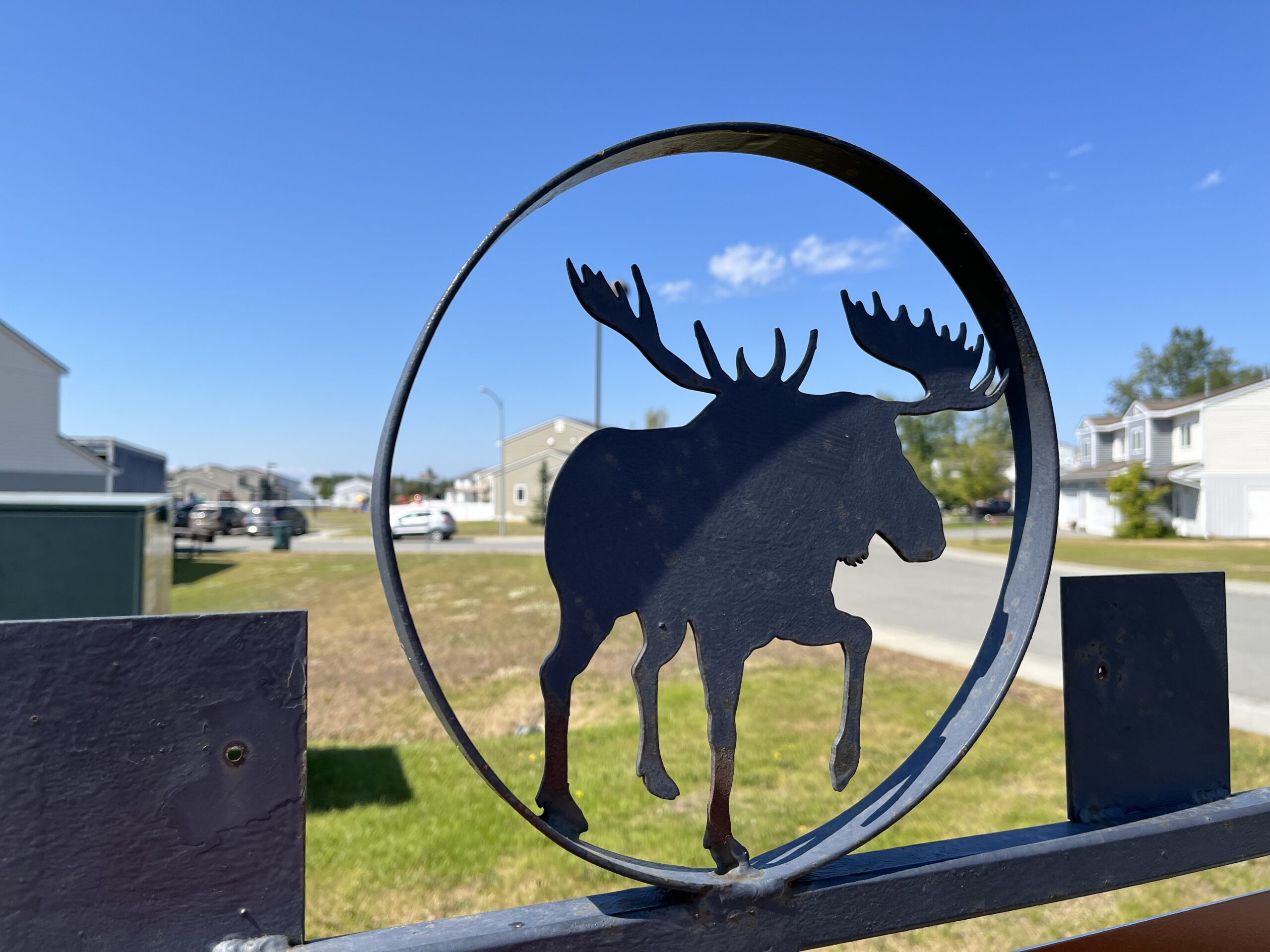
Beyond navigation, the wayfinding system was designed to reinforce the identity of Aurora Military Housing. Neighborhood identification, zone gateways, destination naming, and environmental graphics drew inspiration from Alaska’s landscapes, wildlife, and natural features. These elements provided memorable visual cues that support orientation while strengthening the connection between individual neighborhoods and the larger community. The result is a wayfinding framework that improves navigation, supports cognitive mapping, and creates a stronger sense of place for residents and visitors alike.
An introduction to wayfinding, an interdisciplinary approach to solving navigational problems
Have you ever wondered what the world looked like before the advent of signs? In one form or another, humans have always used signs to identify, direct, and inform each other about the world around them. My favorite example is from ancient Rome, when taverns were marked by placing an ivy bush by their entrance. The bush was visible to anyone walking by, letting everyone know that food and spirits were available within. I like this example because it highlights the simplicity of signing but also the complex social contract involved to make it work. Without the cultural context, the bush would mean nothing.
Anytime we read a sign or follow directions, we are doing a little mental gymnastics in order to decipher the information. Between the physical marker and the information needed to be relayed, there is a cognitive gap that is filled by our understanding of language, spatial awareness, and cultural symbols. Because signifiers can be interpreted differently based on a person’s understanding and personal experience, this gap can be the catalyst for confusion. Just think about the last time you tried in vain to understand a confusing street parking sign. Is it okay to park here? Who knows? The sign is trying to tell me where I can park — but I can’t figure out where that is. I’m just going to park here and hope I don’t get a ticket.
In the mid-20th century, a handful of architects, designers, critics, and scholars set to work on closing this cognitive gap by developing a methodology around sign systems. At the time, globalization was in full swing and built environments were becoming more complex and difficult to navigate. Large metropolitan areas turned into international crossroads with travelers from all around the world. The people working on these large-scale projects needed a way to evaluate their sign systems to make sure information was being effectively disseminated. By pulling from their respected fields, these early pioneers develop a new discipline called “way-finding,” which combined the adjacent fields of information design, graphic design, and industrial design.
Wayfinding is an interdisciplinary approach to solving navigational problems. By implementing information design techniques — first by defining the problem, collecting data points, prototyping and testing solutions, and evaluating the solutions based on user interactions — wayfinding is able to bring order to large and complex spaces. In order to communicate that information in a clear and compelling manner, wayfinding has adopted graphic design theories of ideation, typography, and iconography. Industrial design rounds off the wayfinding process to solve three-dimensional problems and integrate built structures into the surrounding environment.
Long row of confusing parking signs in Culver City, CA.Travelers check in at Chicago O’Hare International Airport while directional signs hang overhead.
Hidden in Plain Sight
We actually interact with wayfinding systems all the time — mostly without knowing it, or at least not knowing what to call them. Airports, train stations, universities, museums, sports stadiums, hospitals, vehicular traffic signs, parking garages; almost every public space incorporates some sort of wayfinding system. The signs, maps, markers, digital screens, and directions we use to navigate a space were planned and designed by someone. If the planning and implementation is done right, you won’t even notice it. Like good typography, good wayfinding is invisible. The user won’t stop to consider the how or why, but will simply interpret the information quickly and use it to make their directional choice.
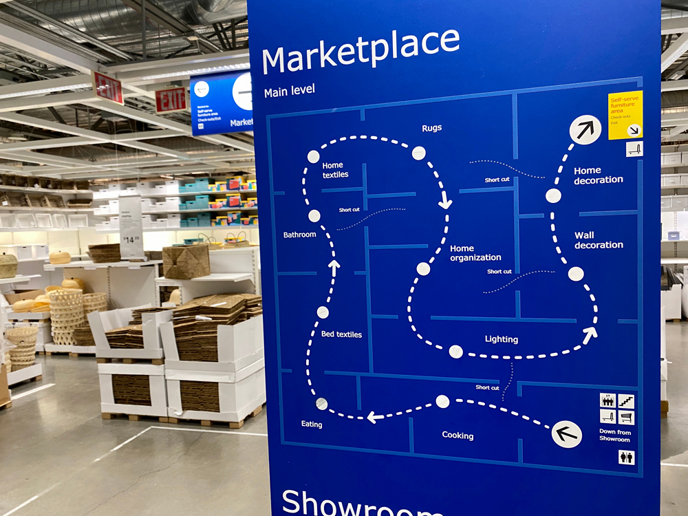
One place where the wayfinding system is front and center is IKEA. My family took a ride out to IKEA about a year ago, when my daughter was 4. My wife was looking for some kitchen gadgets, but I took the opportunity to explain wayfinding to my daughter and show her what I do for a living. We made a game of it — like pirates looking for treasure. First, we found our location on the map.
“Okay, we are here and we need to go there.” I said pointing at the map with my finger. “Which direction should we go?”
She looked at the map and then looked around the store. Her mind was relating the two — the real space and the abstract version of the space. “This way!” she exclaimed like Archimedes.
“Look for an arrow. Do you see an arrow?” I would ask.
“I see it, I see it! Come on, Daddy!” she yelled excitedly. She was filled with so much pride when we finally made it to the end of the store. I can relate to my daughter’s excitement and pride. There is a certain satisfaction that comes with following a map or directions and getting to your destination unfettered.
Conversely, being lost carries feelings of dread and anxiety. Those feelings of being lost can be overwhelming in stressful environments — like hospitals or airports. That’s why unnecessary design elements should be omitted. Simple designs are easier to understand, and their messages are more likely to be remembered. Condensing complex information into simple directions will help people move around with confidence.
“Okay, we are here and we need to go there.” I said pointing at the map with my finger. “Which direction should we go?”
A Helping Hand
Wayfinding is all about helping people navigate using information to solve decision-making problems and should always be sympathetic to the end user. The goal is not to herd people but to encourage successful exploration. Every turning point is a decision. Providing people with information at each decision point will help them move from point A to point B. Many times, people will have one or two “side-quests” along with their primary destination. An undergrad student might have to stop by the Admissions Office before heading over to the Dining Hall, or someone visiting a hospital might want to stop by the gift shop and pick up some flowers before visiting their loved one. Sometimes the secondary destination is just as important, like finding a parking lot in a large urban area close to your primary destination. Or the right bus line to take you to the train station.
Weaving all the different destinations, side-destinations, and their routes together with clear directions is the arduous task of the wayfinding planner. For this reason, a successful wayfinding system introduces simple logic and patterns that can be discerned by the broadest demographic possible. The easier people can identify the pattern, the more accurate their presumptions will be — which is critical for synthesizing spatial data and making a mental map.
It takes time, planning, and a lot of walking to discover the inherent patterns (or lack thereof) concealed within a space. It also helps to have access to architectural drawings or maps to gain a bird’s-eye view. Seeing the space from both the macrocosm and microcosm will assist in spotting natural routes and pathways, aggregating common spaces, and recognizing traffic patterns. Talking with stakeholders and end users is an invaluable part of the discovery phase and should never be overlooked. Just by conversing a few minutes with someone who routinely roams the corridors, you’ll quickly discover the unique challenges each space offers.
Direction signs in Philadelphia. The city is divided into districts and these signs group and color code destinations within each district. Walkers are encouraged to explore the city and it’s attractions.Hospital floor plan showing pathways and how different user-types might move through the space.
Hospital floor plan with annotations showing sign and wayfinding locations.
More often than not, a space or facility will serve a variety of end users. The information collected during this period (considered the discovery phase) will aid in understanding the different types of end users and how they will potentially interact with the wayfinding system. A customer may need a different set of directions than a staff member or vendor. End users ought to be evaluated and grouped based on their specific wayfinding needs. Each subsequent group should then be placed in a hierarchy chart. Putting each group within a hierarchy chart sets precedent and creates priorities between different user demands. For example — patients at a hospital would have a higher priority than the hospital’s pharmacy staff and their needs would be considered first during the planning stage.
Priority sequence of users’ demands.
Groups can be further subdivided based on contradictory user demands. It’s no surprise that someone traveling by train would be the dominant end user at a train station. So naturally, their success is the most important task of the wayfinding system. It’s also safe to assume that giving them key information, like platform directions, have the highest priority. But that same traveler might also want a cup of coffee before they depart the station. One destination is obviously more important than the other, but both are necessary for a happy traveler. The wayfinding system should reflect this priority among groups and their sub-demands when displaying and sequencing information.
The Right Place at the Right Time
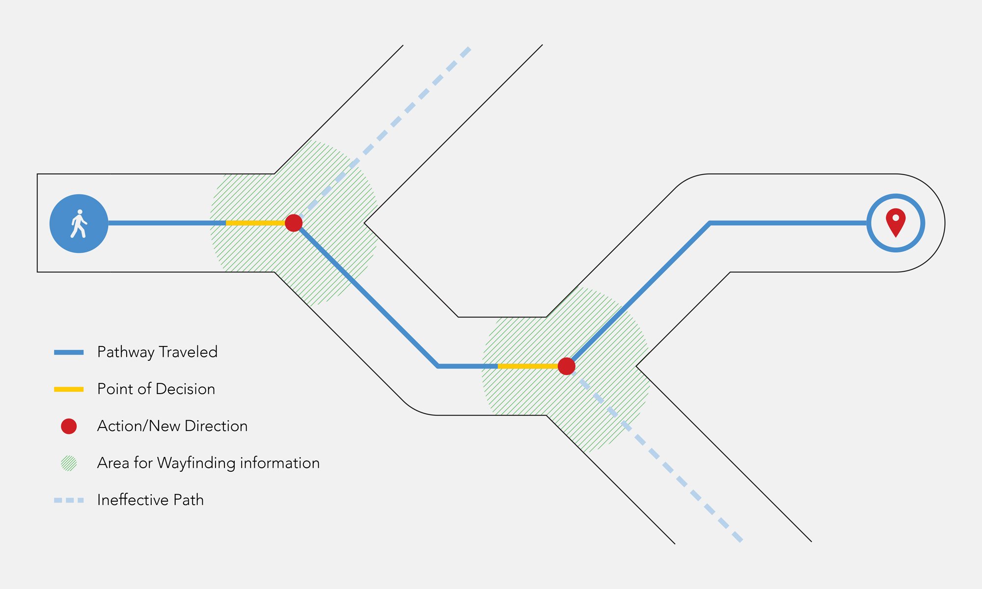
Wayfinding problems are the sum accumulation of several small problems. Each minor difficulty in orientation leaves a gap in the pedestrian’s spatial awareness. Enough gaps and the end users will be lost. Giving the end user the right information at the right time is how wayfinding overcomes these gaps. This process is often referred to as progressive disclosure — sequencing the disclosure of information based on priorities developed in the previous phase. Progressive disclosure is implemented at critical intersections and major decision points. Providing people with the right information only when they need it cuts down on confusion. Giving major-decision making directions first, like entranceways and parking garages, then more specific destinations/information as you move along a route is considered best practice.
Wayfinding information is required at all points of decision.
The way in which the information is implemented relies heavily on the architecture and division of space. People rely on architecture first when looking for navigational clues — only turning to wayfinding when the architecture fails them. This is also true for urban spaces and parks. Rooted in our biological prowess of navigation, people use form, layout, and size as their primary clue givers — all of which are the tools of architecture. Visual landmarks and architectural means such as color, light exposure, and interior decoration are more indicative to navigational aids like passageways, turning points, entrances and egress, and critical decision points.
These areas of design should be left to the architects and the wayfinding system should play a supportive and harmonious role. The sooner the wayfinding system can be addressed during the process, the easier the integration will be. As a wayfinding planner, using the architecture and people’s natural habits to your advantage will only benefit the overall system. If you do, pedestrians will be more likely to use your directions and have a higher rate of success.
Information Is Key
After collecting all the data, cataloging all the locations, and determining the appropriate message for each location and decision point — the next step is to develop the graphic elements and industrial products that will make up the physical components of the wayfinding system. These components can be physically or digitally integrated into the space and will be the “user interface” for your system. Common components are identification and directional signs, maps, physical markers, graphic representations, and precisely generated nomenclature. Developing these components should only be considered after, or near the end, of the information stage. And for good reason. The information collected will dictate graphical elements, like the size needed to display readable copy at the viewing distance, which will in turn affect industrial elements like the build and materials.
It all begins and ends with the information. A successful wayfinding system is only possible with successful information design and the final product is only as good as the data you capture. And since wayfinding projects may take months or even years to complete, you don’t want to waste all that time on something that isn’t working. If you have incomplete or inaccurate data, the project will just spin its wheels and whatever solution you develop will be less than satisfactory. With good data, the whole process is a rewarding experience — for the designer(s), client, stakeholders, and end users. Every day, I see first-hand how wayfinding systems can improve people’s experiences and help them find their way. Similar to the bush in front of Ancient Roman taverns, without data and information design, signs would only be pictures on a wall.
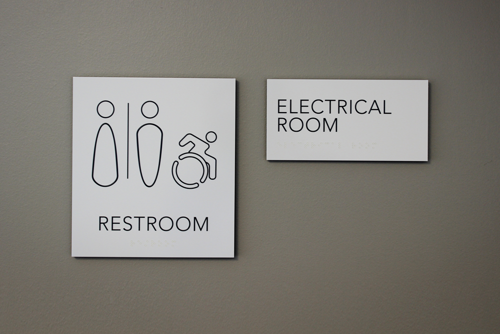
Sign system showing general construction and design elements.Restroom and room identification signs with raised copy and clear braille for the visually impaired.